Data Visualization Basics: Turning Raw Data into Insights
The main purpose of data visualization is to make data easier to understand. Raw numbers can be confusing, especially when there is a lot of information in one place. Visuals help simplify that information so people can quickly see what is happening.

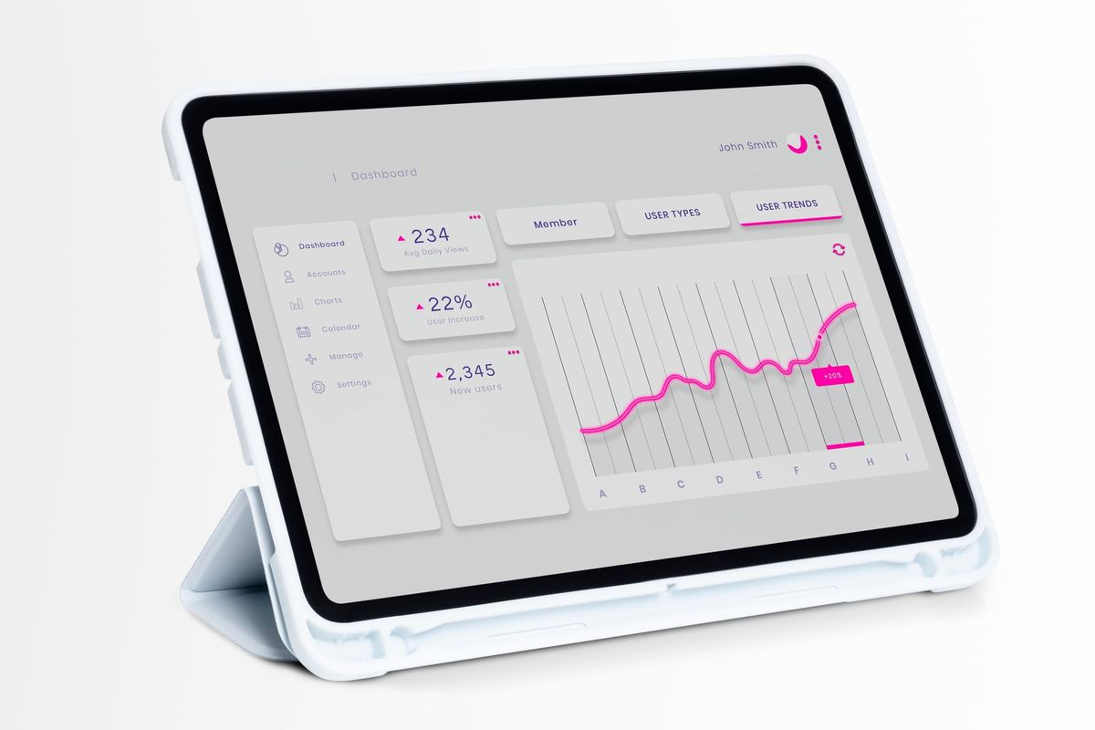
Data visualization is the process of presenting data in a visual form such as charts, graphs, maps, or dashboards.
It helps people understand information more quickly than looking at long tables of numbers. In data analytics, visualization is important because it turns raw data into meaningful insights that are easier to see and explain. A well-designed chart can reveal trends, patterns, and comparisons that may not be obvious in plain data. This article explains the basic concepts of data visualization and why every data analyst should know them.
Understanding the purpose of visualization
The main purpose of data visualization is to make data easier to understand. Raw numbers can be confusing, especially when there is a lot of information in one place. Visuals help simplify that information so people can quickly see what is happening.
For example, if a company wants to compare sales in different months, a chart can show the trend clearly. Instead of reading rows of numbers, viewers can instantly notice whether sales are rising or falling. Good visualization saves time and improves understanding.
Choosing the right chart
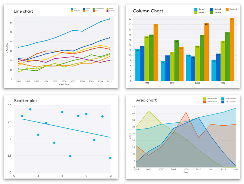
Different types of data require different types of charts. A bar chart is useful for comparing categories, a line chart works well for showing changes over time, and a pie chart is used to show proportions. Choosing the right chart is important because the wrong chart can make data harder to understand.
For example, if you want to show monthly sales growth, a line chart is better than a pie chart. If you want to compare product categories, a bar chart is usually the best choice. A data analyst should always choose a chart that matches the message of the data.
Keeping the design simple
Simple design is one of the most important rules in data visualization. If a chart has too many colors, labels, or effects, it can become confusing. The goal is to make the data clear, not to decorate it unnecessarily.
A clean chart with readable labels and proper spacing is easier for people to understand. Simple design also helps the audience focus on the important information. Good visuals should be attractive, but they should also be easy to read.
Using colors wisely
Color is a powerful part of visualization because it helps highlight important data. However, too many colors can distract the viewer. A good analyst uses color carefully to show differences, emphasize key points, or group related data.
For example, one color can be used for sales growth and another for sales decline. This makes the chart more meaningful and visually clear. Color should support the message of the chart, not overpower it.
Labeling charts clearly
Standardizing means making data follow one common style or format. In real datasets, the same information may Every chart should have clear labels, titles, and legends if needed. Without labels, viewers may not understand what the data represents. A title should tell the audience what the chart is about, and axis labels should explain the values being shown.
For example, if a chart shows revenue by month, the title should mention revenue and time clearly. Clear labeling makes the chart easier to interpret and more professional. It also prevents confusion when the chart is shared with others.
Showing trends and patterns
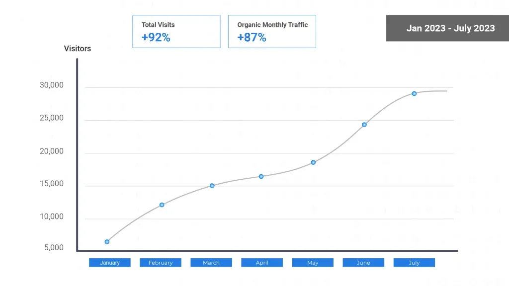
One of the biggest strengths of data visualization is that it helps reveal trends and patterns. A trend is a general direction in which data moves over time, such as increasing, decreasing, or staying the same. Visualization makes these changes easy to notice.
For example, a line chart can show that website traffic increased after a marketing campaign. This kind of insight is important because it helps businesses understand what is working. Visual patterns often lead to better decisions.
Comparing values
Visualization is very useful for comparing values across different groups. You may want to compare sales between cities, performance between teams, or expenses between months. Charts make these comparisons much easier than tables of raw numbers.
A bar chart or column chart is often a good choice for this type of comparison. When values are shown visually, the biggest and smallest amounts become easier to identify. This helps analysts communicate information more clearly.
Using dashboards
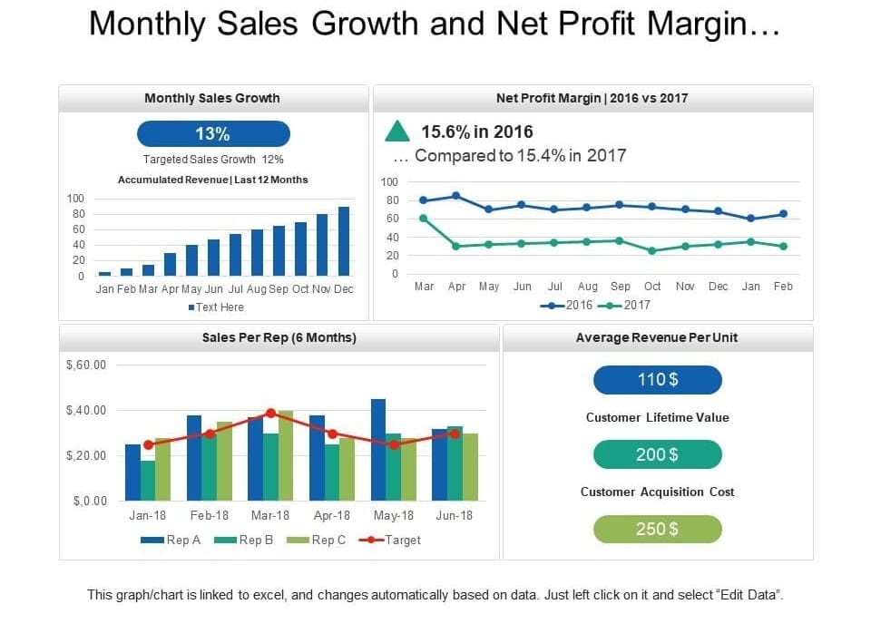
A dashboard is a collection of charts and visuals placed in one view. It gives a quick summary of important data and is often used in business reporting. Dashboards help users monitor performance and make decisions without looking through many separate reports.
For example, a sales dashboard might show total revenue, top products, and monthly growth in one place. This makes it easier to track progress and identify problems quickly. Dashboards are very useful because they combine multiple insights into one simple display.
Avoiding misleading visuals
Data visualization should always be honest and accurate. A chart can mislead people if the scale is wrong, the data is incomplete, or the chart is designed to hide important information. A good analyst must make sure the visual tells the truth.
For example, changing the axis scale too much can make a small change look very large. That can confuse the audience and lead to wrong conclusions. Ethical and accurate visualization is a key part of responsible data analysis.
Turning visuals into insights
The final goal of visualization is not just to create charts, but to find and communicate insights. An insight is a useful understanding that helps explain what the data means. A chart becomes valuable when it helps people make decisions.
For example, if a chart shows that sales are falling in one region, the business can investigate the cause and take action. This is how raw data turns into useful knowledge. Data visualization is powerful because it connects numbers with meaning.
CONCLUSION
Data visualization is a very important skill for every data analyst. It helps turn raw data into simple, clear, and useful insights. By choosing the right chart, using color carefully, labeling clearly, and keeping designs simple, analysts can communicate data more effectively. Good visuals make it easier to understand trends, compare values, and make smart decisions. For beginners, learning the basics of visualization is a strong step toward becoming a better analyst.