
Dark Mode vs Light Mode: Which One Is Better for Users
Dark mode usually has light text on a dark background in order to ensure the visibility of text and has gained popularity for its look and reduced eye strain in the age where everyone seem to be on some form of technology.

Shreya - Make it at least 600 to 700 words for every topics.
Choosing the right color palette for any designer is the number one step in making their art great. Designing for both light and dark modes isn’t just about making things look good in different lighting conditions; it’s about enhancing the user experience.
This article delves into the nuances of dark and light mode in UX, analyzing user behavior trends, and design best practices to help designer make informed decisions that align with user needs and their preferences.
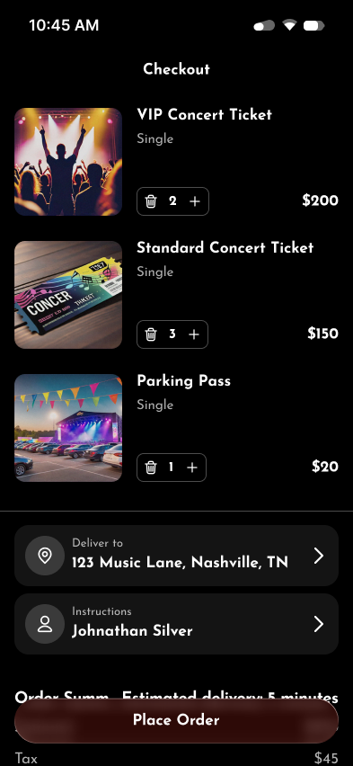
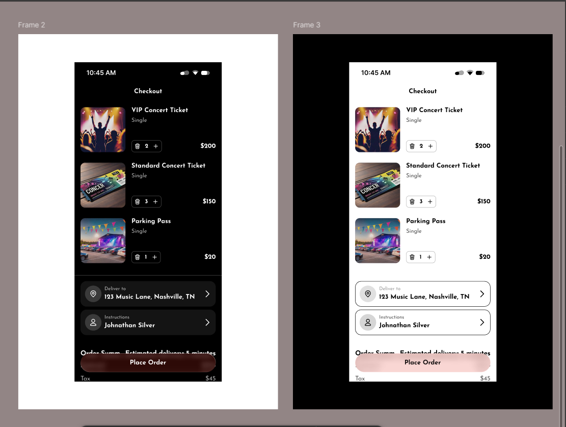
Dark mode usually has light text on a dark background in order to ensure the visibility of text and has gained popularity for its look and reduced eye strain in the age where everyone seem to be on some form of technology. It’s often preferred in low-light environments by users seeking a visually softer interface in order to reduce glare and eye fatigue.
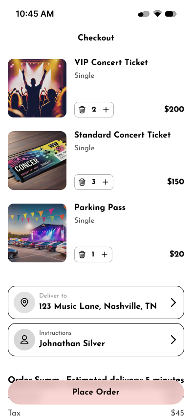
Meanwhile, light mode is a traditional design approach which has inverse palette of dark mode i.e. typically dark text on a white or light background. It is known for its clarity and familiarity, especially in brightly lit or natural environments in order to enhance the visibly as well as readability for users.
Even though both has its own set of properties and advantages; a designer must be mindful that Light mode must avoid stark brightness that causes glare, while dark mode should prevent washed-out text that strain eyes.
Psychological Effects: Dark mode can evoke feelings of sophistication and modernity, while light mode evokes openness, cleanliness, and simplicity.
Screen Technology: OLED screens can benefit battery life with dark mode as in there is less power consumption in dark mode than light mode, influencing mobile usage patterns.
In Figma, both modes can be implemented by using reusable color variables that helps designer create a well-functioning design that work in both themes.
Ultimately, the choice between dark mode and light mode depends not on its own merits but on context, what a user prefers, and developers' goal is. Regardless, the job of a designer is to cater to the user experience and to ensure that whatever mode user may prefer; we provide the best on both sides